Naoto Fukasawa, a renowned designer says: “There is always something present between people and objects, be it air, or a certain atmosphere, and to me, this is ”the medium”. If we examine the information revealed by this medium, we find that it is the very taste of the inhabitants, who are thinking about their environment and reflecting on themselves; thus a ‘home’ becomes the quickest way to understand the real personality of a person, a medium for dialogue between people and space. So, what are the respective messages conveyed by the quarter mismatch and mismatch in the space?
Various methods of veneer lamination
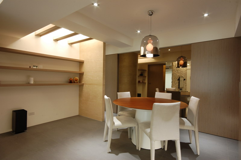
Quarter Mismatch: free and simple rustic style
Natural, comfortable, earthy colors are typical of the rustic farmhouse style, and the textures and rustic colors and tones of original wood furniture preserve the freedom of space, with no standard design. Not only are the dining table, coffee table and chairs available in wood, but a whole range of wooden cabinets and walls can be created with the use of great looking and inexpensive veneered panels.
By turning the straight-grained natural wood veneer through 90 degrees, the simple lines of the veneer become an extension of the space, allowing the light to flow in and out, extending the horizons of the small area, and drawing in the greenery to keep the space fresh and vibrant.
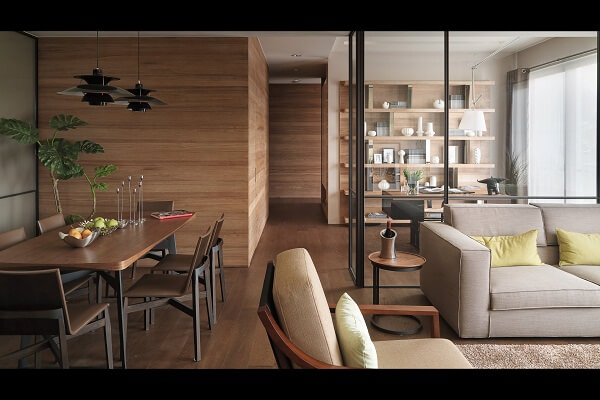
Project picture (Photo credit/Wadi Design)
The natural and simple straight lines of the original layout and the Japanese ethos of practical storage, complete the design of the white furniture including the cabinets, sliding doors, tables and chairs without any feeling of overkill. By eliminating excessive decoration and leaving only the most basic functions of the furniture, the occupants have made use of the natural color of the veneer panels, making the simple space more complex, with a sense of natural layers, forming a modern rustic space with a clever blend of technology and good taste.
Mismatch: Elegant and Light Classics
With the concept of ‘people as the main focus’, the straight lines are interspersed with mountain like patterns, giving the wood veneer a livelier expression and allowing more possibilities within the space, not only for with TV wall and the solid wood veneer walls, but also for the rough white stone area and the tiled floor.
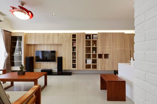
Project picture (Photo credit/Sheya Space Design)
The straight and curved grains of the solid wood veneers express the elegant and rich taste of the occupants, while the simple design style is enhanced by the warm touch of the wood, making it more stress-free and natural.
One advantage of using solid wood pieces, is to use the straight grains to brush through the intricate details of classicalism and the curved crown grains to break up the visual, and embellish the splendor of the large space, whilst the warmth of the solid wood color palette can better accentuate the neo-classical flavor of the room. The curved grain of the quarter/crown-cut panels allows the elegant laurel leaf wall decor to stand out, giving the whole space an openness and a unique sense of interaction and flow in tandem.
►See Products
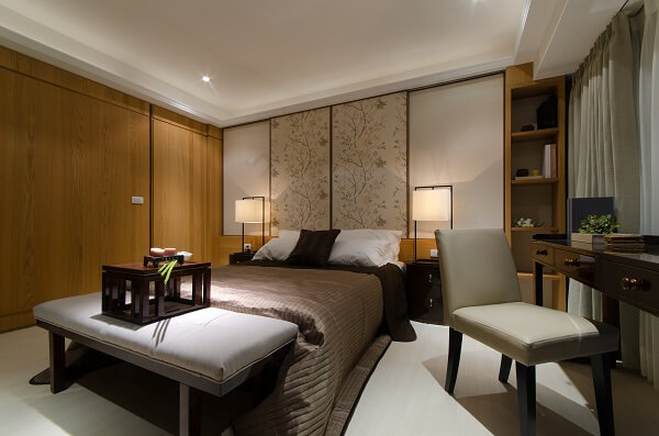
Project picture (Photo credit/Fujian Design)
